BC lemonade
BC, La Campagnola
Juice
Packaging Design
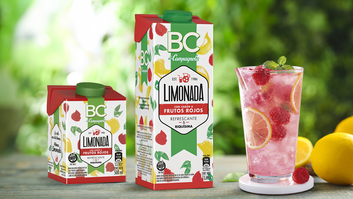
The main objective of the brief was to design packaging for the lemonade line that breaks with the traditional look and feel of the brand, conveying the refreshing sensation of these drinks and connecting with a younger audience accustomed to finding such products in more niche brands. Additionally, this project was framed in extra complexity: due to local regulations, we couldn’t display the fruit in any of its presentations.
The textures and minimalist designs grab attention on the shelves of mass consumption, where products are often overloaded with images, logos, and colors that can sometimes overwhelm the consumer.


The main challenge was undoubtedly to convey freshness and flavor without being able to showcase the fruits of each presentation, which are the main element in the packaging design of these types of products.
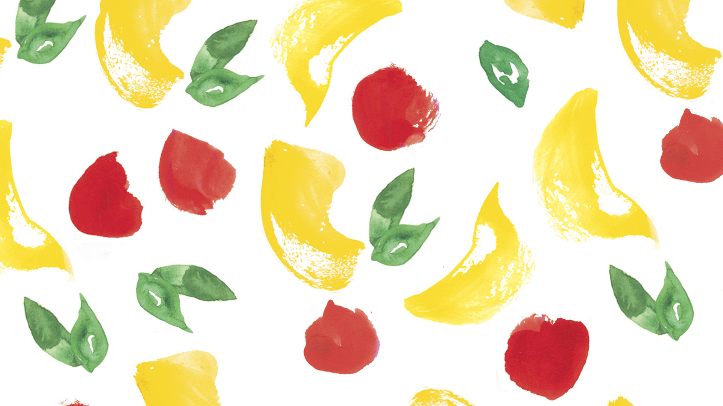
With the illustrations of Maite Ortiz, we developed a system of textures that allowed us to communicate and differentiate each flavor. Starting from a trendy and minimalist aesthetic that, even while respecting the brand’s palette and visual codes, could stand out on the shelf and quickly capture the attention of consumers.
BC, a low-calorie food and juice brand from La Campagnola, decides to launch a new line of ready-to-drink lemonades in three unique flavors: Mint and Ginger, Traditional, and Red Fruits. We designed this special packaging for them, aiming to convey naturalness, modernity, and flavor for an increasingly discerning audience.