La Campagnola redesign
La Campagnola
Food
Architecture and design of packaging line.
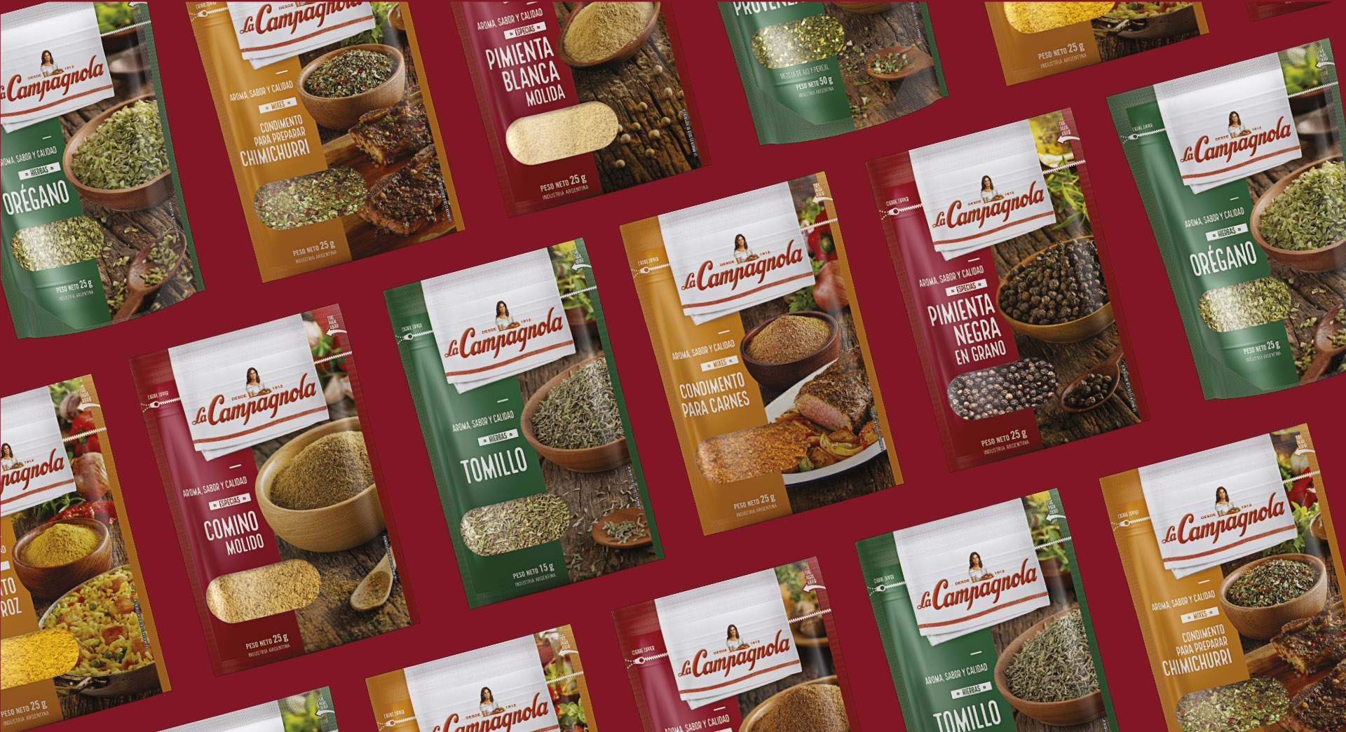
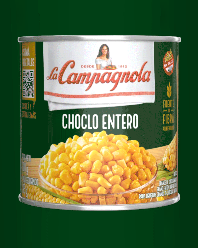
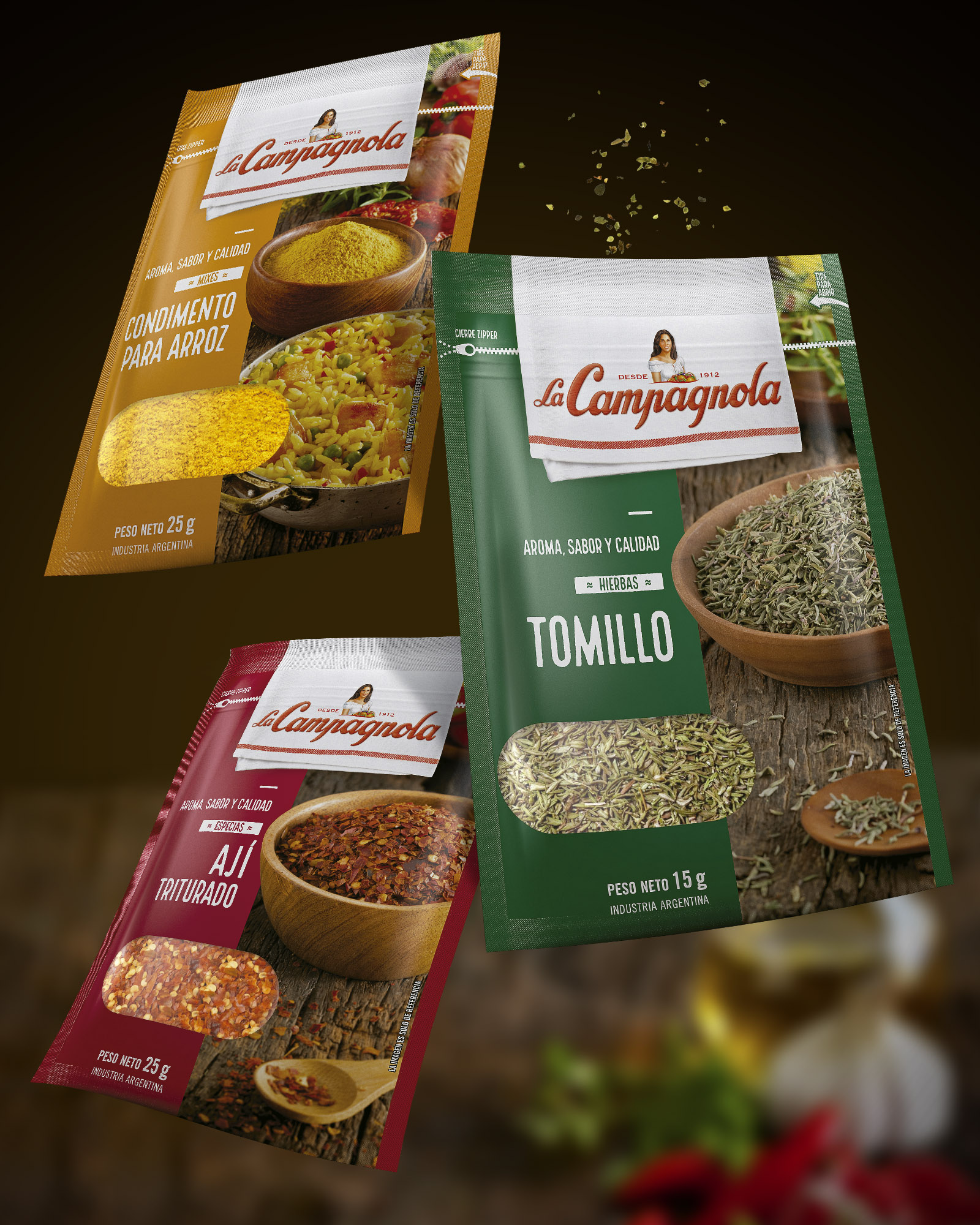
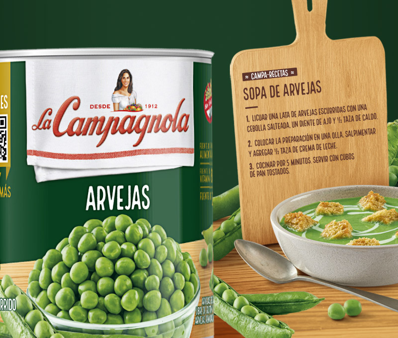
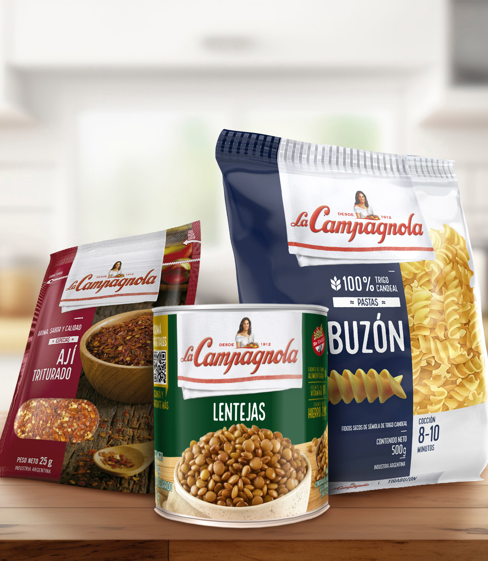
La Campagnola introduces its new line of spices and pasta to the market with a design that communicates closeness and a love for homemade food, while also inviting the consumer to get involved and cook. This concept is also extended to the entire canned vegetable line, where we include recipes and a QR code with useful cooking content.
The leading brand in the Argentine food market launches its new line of pasta and spices. To achieve this, we needed to align the new designs with the current portfolio while finding an aesthetic that allows it to stand out on the shelf as a premium product within its segment.
For those who enjoy cooking, that moment is special and unique. However, beyond the final result on the plate, the quality of ingredients and the practicality when facing the kitchen are equally important. La Campagnola, the most traditional food brand, is the ideal companion for Argentine dishes, ensuring that all your meals will be a success.
Communicating all the values of a brand with many years of history is always a challenge. Delving into the concept of closeness while maintaining quality is not easy either. However, the most challenging aspect is to think about a coherent layout that can be applied to a brand with many product lines and in constant growth.
The incorporation of the new application of the logo (on a kitchen towel), combined with the addition of new elements such as images of ingredients and noble materials (wood, iron), allowed us to create a brand image that is warmer and more representative of the cooking moment. At the same time, we chose to keep all information as clean as possible to facilitate reading for our consumers, using full colors and images displayed in a free and clear manner.